MrBeast thumbnail breakdown: 7 elements that get 100M+ views
Why do MrBeast's thumbnails consistently get massive views? Breaking down the exact elements he uses and how you can apply them to your own content.
Why MrBeast's thumbnails work (it's not just budget)
MrBeast doesn't just spend millions on videos—he applies a ruthless, data-driven system to every thumbnail. After analyzing hundreds of his thumbnails, seven consistent elements emerge. These aren't creative choices. They're optimization decisions based on what actually gets clicks. The good news? Most of these elements have nothing to do with production budget. You can apply them with any setup.
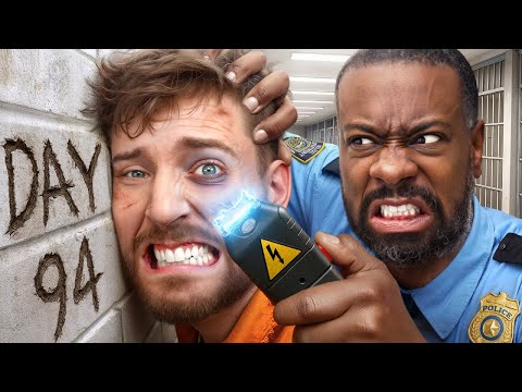
Real MrBeast thumbnail examples
Before diving into the breakdown, let's look at actual MrBeast thumbnails that demonstrate these principles in action. Notice the consistent patterns: extreme facial expressions, bold text with specific numbers, high-contrast colors, and crystal-clear composition even at small sizes.


Element 1: Extreme facial expressions that stop the scroll
MrBeast's face in thumbnails is never neutral. It's always peak emotion—jaw-dropping shock, uncontrollable excitement, or intense focus. Why? Because YouTube feeds are endless scrolling. Your thumbnail has maybe 0.3 seconds to stop someone's thumb. A face showing extreme emotion triggers immediate curiosity: "Why is he reacting that way?" The expression alone creates a story. You don't need context yet—the face makes you want context. This works because human brains are hardwired to notice faces and read emotions instantly. A neutral face gets scrolled past. An extreme expression forces a pause.
- Eyes wide open - Shows genuine surprise or shock, signals something unexpected happened
- Mouth open or huge smile - Conveys excitement or disbelief, makes viewers mirror the emotion
- Direct eye contact - Creates connection, makes viewers feel like he's speaking directly to them
- Exaggerated not fake - The emotion is real (from actual video moments), just amplified for thumbnail
Element 2: Bold text with massive numbers
MrBeast's text isn't there to "look nice"—it's there to communicate value instantly. Notice the pattern: "$1,000,000", "100 Days", "Last To Leave". Always a specific, extreme number paired with a clear action or challenge. The text is thick, bold, and usually white or yellow with heavy black outlines. Why these colors? Maximum contrast. The text needs to be readable on any device, any screen brightness, while someone is scrolling fast. The numbers create immediate scale comprehension—you instantly understand the stakes. "I spent $1M" tells you more in 3 characters than a paragraph could.
- Ultra-thick font weight - Makes text readable even at tiny mobile sizes
- White or bright yellow text - Creates maximum contrast against any background color
- Heavy black outline - Ensures text pops even if background is similar color
- 3-5 words maximum - No time for full sentences, just the essential hook
- Numbers with commas or $ - Makes scale instantly recognizable ($1,000,000 not 1000000)
Element 3: High-contrast color schemes
MrBeast's thumbnails use bold, saturated colors that almost hurt to look at—and that's intentional. Common combinations: bright blue backgrounds, vibrant reds, electric greens. Never muted, never subtle. Why? Because YouTube is visual chaos. Hundreds of thumbnails competing for attention in a feed. Saturated, high-contrast colors cut through the noise. They create what designers call "visual pop"—your eye is drawn to the brightest, boldest element on screen. MrBeast's thumbnails don't blend. They demand attention through pure color intensity.
- Saturated primary colors - Blues, reds, greens at maximum intensity
- Never grayscale or muted - Subtle color palettes get lost in YouTube feeds
- Contrasting color combinations - Blue subject on red background, yellow text on blue
- Background often single solid color - Keeps focus on face and text, not busy backgrounds
Element 4: Clear composition with single focal point
Look at any MrBeast thumbnail—your eye knows exactly where to look. There's never confusion about what's important. Usually it's his face (huge, often taking up 40-50% of the thumbnail) plus bold text. That's it. No clutter, no multiple competing elements, no complex scenes to decode. This is called visual hierarchy, and MrBeast executes it perfectly. The viewer's eye path is designed: Face first (emotion/connection), text second (context/hook), background third (reinforcement). The entire thumbnail can be processed in under a second, which is crucial when people are scrolling at speed.
- Face takes up 40-50% of thumbnail - Much larger than typical thumbnails
- Subject always in sharp focus - Background slightly blurred to enhance separation
- Text positioned strategically - Never covering the face, placed in empty space
- One main subject maximum - Not multiple people or objects competing for attention
- Rule of thirds - Face usually positioned off-center for dynamic composition
Element 5: Context cues that tell the story
While MrBeast keeps thumbnails simple, he includes subtle visual cues that reinforce the video's concept. If it's a money video, you might see stacks of cash or a vault in the background. If it's a challenge, you see the challenge environment. These context elements are always secondary—never competing with face and text—but they answer the viewer's immediate question: "What am I about to watch?" The background isn't decorative; it's informational. It confirms what the text promises. This reduces friction: viewers know exactly what they're clicking on, which paradoxically increases clicks because there's no uncertainty.
- Environmental context - Location or setting visible but not distracting
- Props that reinforce concept - Money, challenges, products visible but secondary
- Never random backgrounds - Every element connects to the video topic
- Simplified not detailed - Context is suggested, not fully explained
Element 6: Mobile-first design philosophy
Here's what most creators miss: over 70% of YouTube views happen on mobile devices. MrBeast designs thumbnails for a screen the size of your palm, not a desktop monitor. This means everything is bigger, bolder, simpler than you think it should be. Text that looks "too big" on desktop is perfect on mobile. Faces that seem "too close" on laptop screens are exactly right on phones. He tests every thumbnail at mobile size first. If it works on mobile, it works everywhere. If it only works on desktop, it doesn't get used. This single shift in perspective—designing for the smallest screen first—transforms thumbnail effectiveness.
- Test at actual phone size - View thumbnail at 320x180px before publishing
- Text readable without zooming - If you have to squint on phone, text is too small
- Face details visible on mobile - Expression must be clear even at thumbnail size
- No fine details - Anything requiring close inspection doesn't work
Element 7: Consistent branding without being boring
Every MrBeast thumbnail is instantly recognizable as a MrBeast thumbnail—but they're never repetitive. How? He maintains consistent elements (bold text style, face-forward composition, saturated colors) while varying the specific execution. The branding is in the structure, not the exact design. This creates pattern recognition: viewers scrolling their feed subconsciously recognize "this is a MrBeast video" before even reading the title. Pattern recognition builds trust and increases click-through because viewers know what quality level to expect. But variation prevents fatigue—each thumbnail feels fresh while being familiar.
- Consistent font style - Same bold, outlined text approach across all videos
- Recognizable color palette - Bright, saturated colors but varied combinations
- Similar composition structure - Face + text layout remains consistent
- Varied specific execution - Different expressions, numbers, contexts each time
How to apply MrBeast's system to your content
You don't need MrBeast's budget to use his thumbnail strategy. Here's the practical application:
- Step 1: Capture extreme expressions - Film yourself reacting genuinely to content, get 10+ expression options
- Step 2: Use bold, thick fonts - White or yellow text, heavy black outline, 3-5 words max
- Step 3: Choose high-contrast colors - Saturated backgrounds, avoid muted tones
- Step 4: Simplify composition - One face, one text element, minimal background
- Step 5: Add context subtly - Include props or environment hints that support the topic
- Step 6: Test on mobile first - Screenshot your thumbnail and view it at phone size
- Step 7: Maintain consistent style - Pick your structure and stick to it across videos
Common mistakes when copying MrBeast's style
Just making faces and adding bold text isn't enough. Here's what kills MrBeast-style thumbnails:
- Fake expressions - Forced, posed emotion looks fake; use real reactions from actual content
- Too much text - More than 5 words becomes unreadable on mobile
- Low contrast - Muted colors or thin fonts fail to pop in crowded feeds
- Multiple focal points - Trying to show everything shows nothing clearly
- Desktop-first design - Looks great on computer, invisible on phone
- Inconsistent branding - Changing style every video prevents pattern recognition
The technical execution: Creating MrBeast-style thumbnails
Understanding the elements is step one. Executing them efficiently is step two. You can recreate MrBeast's thumbnail system using AI tools that handle the technical aspects—font styling, text placement, color optimization, and mobile readability. The workflow: Choose a photo with strong facial expression, select bold font style (or reference a MrBeast thumbnail to clone the exact look), add your text (keep it under 5 words with specific numbers), generate and test at mobile size. The AI handles placement (ensuring text doesn't cover your face), applies proper outlines and contrast, and optimizes for thumbnail compression. What used to take 30 minutes in Photoshop now takes 2 minutes—leaving you more time to focus on which expression and hook to use.
Why this system works for any niche
MrBeast's formula isn't genre-specific—it's psychology-specific. Extreme expressions create emotional hooks regardless of content type. Bold text with specific numbers works whether you're gaming, teaching, or reviewing products. High contrast cuts through noise in any niche. Clear composition reduces cognitive load universally. The elements work because they align with how human attention operates on fast-scrolling platforms. Your content topic changes. The thumbnail principles don't.
Quick takeaway
MrBeast's thumbnail success comes from seven consistent elements: extreme facial expressions, bold text with numbers, high-contrast colors, single focal point composition, strategic context cues, mobile-first design, and consistent branding. Apply these systematically, not randomly.
Create High-Energy Viral Style Thumbnails
Apply MrBeast's 7-element system to your own content. Generate high-energy viral style thumbnails with bold compositions, high-contrast colors, and mobile-optimized design automatically with AI.
Try AI Thumbnail Generator