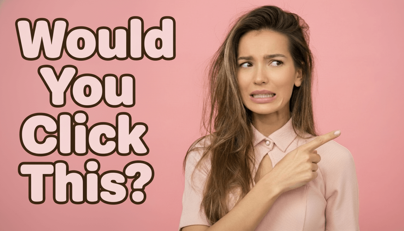
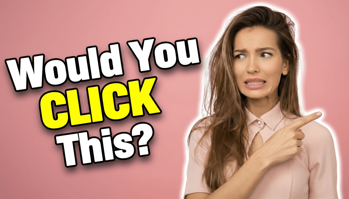
The best fonts for YouTube thumbnails (that actually get clicks)
Stop wasting hours browsing font libraries. Here's how to find fonts that drive clicks—with 9 ready-to-use styles and the AI method that saves hours.
Why most creators waste time on fonts
Here's what nobody tells you: the "best" font for your thumbnail is the one your audience already recognizes. Look at any successful channel in your niche. They're not reinventing typography—they're using proven font styles that viewers trust. Your CTR often comes down to using the visual language your audience already responds to, not finding the most "unique" font.
The three font styles that dominate YouTube
Look at the top thumbnails in any niche and you'll notice the same patterns repeating:
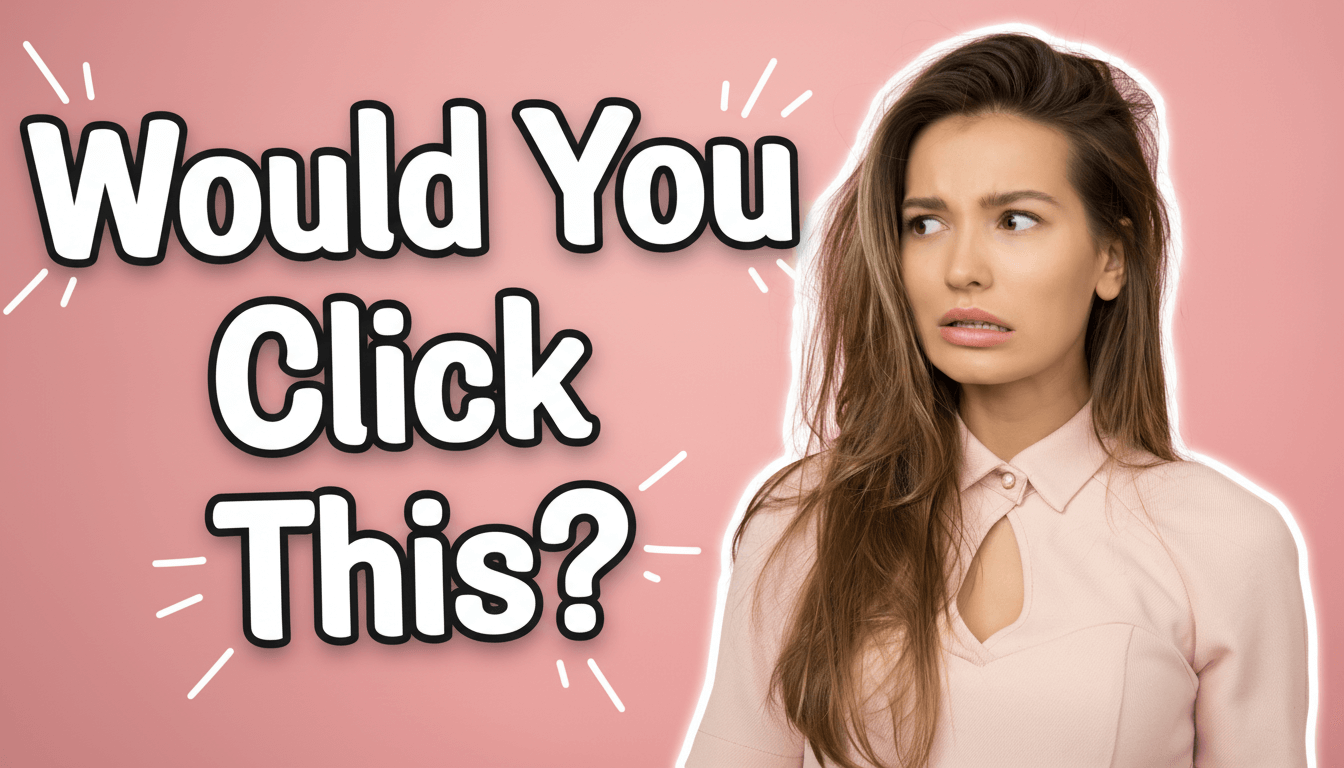
- Bold display fonts with thick strokes that stay readable at any size
- Rounded bubble letters that create friendly, approachable vibes
- 3D inflated text that adds depth and grabs attention instantly
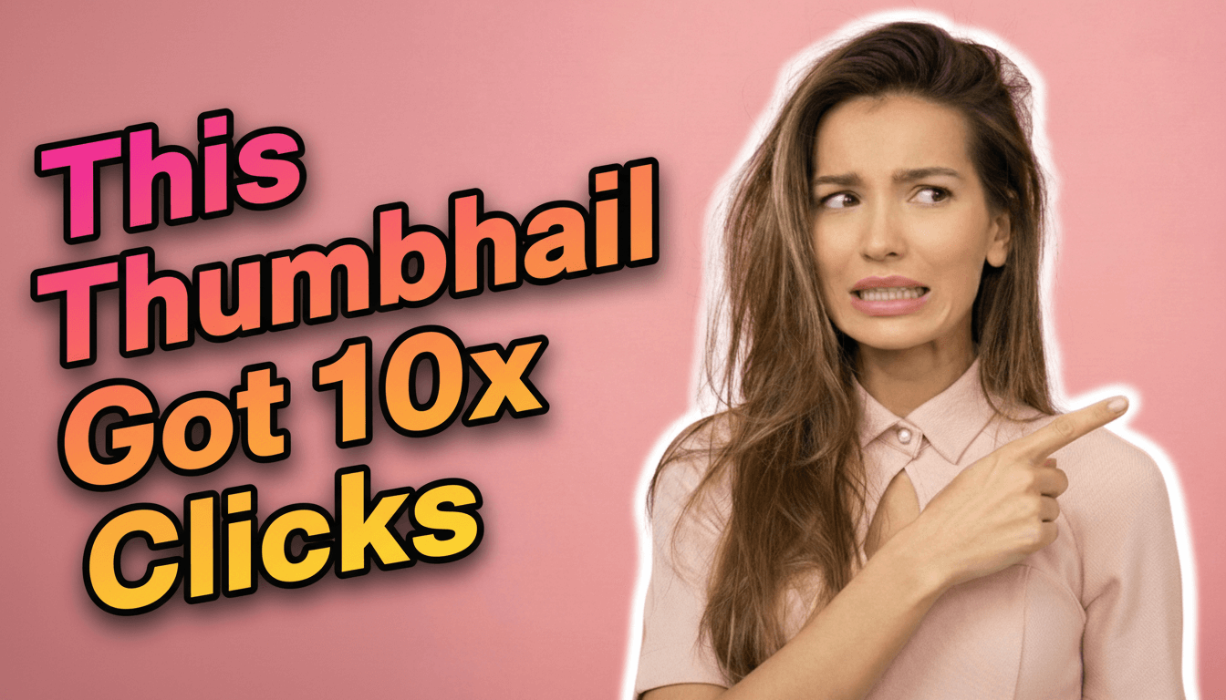
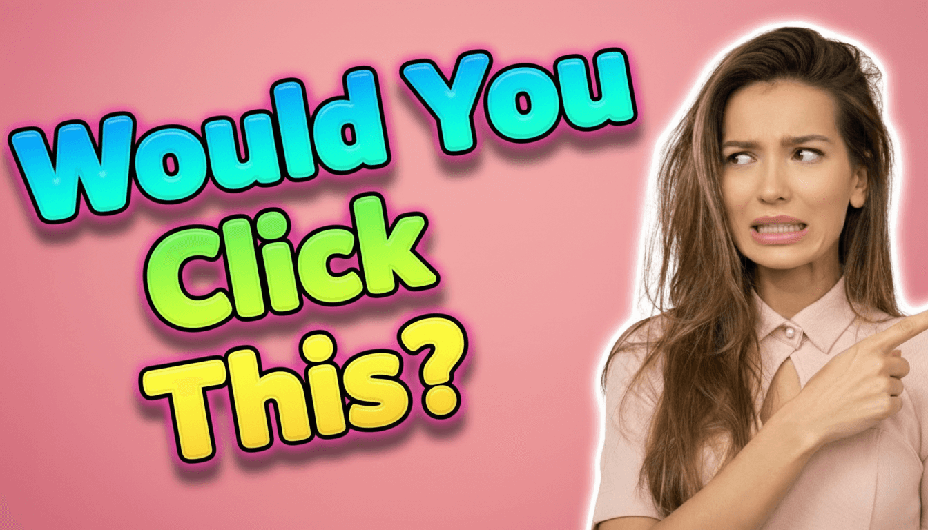
9 battle-tested font styles you can use right now
Instead of spending hours in font libraries, here are 9 proven styles that work across different content types. Each one is optimized for readability even after YouTube compression. Below you can see examples of each style in action:
Story Rounded
Review Slanted
Vlog Marker
3D Inflated Bubble
Ace Contrast
Highlight Block
Modern Banner
Tutorial Ribbon
Ultra Minimal
1. Story Rounded
This is your go-to font when you want to feel approachable and warm. The rounded edges soften the text, making it perfect for vlogs, day-in-the-life content, and personal storytelling. Use Story Rounded when your thumbnail needs to say "come hang out with me" rather than "watch this now!" It works exceptionally well for lifestyle creators, family channels, and anyone building a personal connection with viewers. The effect? Your audience feels invited rather than sold to. Story Rounded stays readable even at small sizes while maintaining that friendly, conversational vibe that makes viewers feel like they already know you.
2. Review Slanted
Want to create urgency? Review Slanted is your weapon. The italic angle creates visual momentum—it literally looks like the text is moving forward. This psychological trick works perfectly for product reviews, tech comparisons, and "versus" content where you're helping viewers make decisions. The slant adds dynamic energy that screams "this is important information you need right now." Use it when you're comparing products, reviewing new releases, or creating buying guides. The effect? Viewers feel FOMO (fear of missing out) and click faster because the slanted text signals time-sensitive, valuable information.
3. Vlog Marker
This hand-drawn style is digital authenticity at its best. Vlog Marker mimics handwriting but stays perfectly readable—it's the sweet spot between personal and professional. Use this when you want to break the fourth wall and make your content feel raw and real. It works beautifully for behind-the-scenes content, personal updates, challenge videos, and any content where authenticity matters more than polish. The slightly imperfect, marker-like quality tells viewers "this is real me, not corporate me." The effect? Your audience feels like they're getting the unfiltered version, which builds deeper trust and connection.
4. 3D Inflated Bubble
If your content is about entertainment, reactions, or high energy, this is your font. The 3D inflated look creates depth that makes text literally pop off the screen. It's impossible to scroll past—which is exactly the point. Use this for reaction videos, gaming content, challenges, pranks, and anything where the emotional response matters more than the information. The bubbly, inflated style creates playful energy that promises fun, not education. The effect? Viewers' eyes snap to your thumbnail in a sea of flat text. It works because it occupies more visual space and creates shadow depth that catches attention even in peripheral vision.
5. Ace Contrast
Sharp, bold, and aggressive—Ace Contrast means business. The hard edges and strong contrast make this perfect for gaming content, tech reviews, competitive content, and anything where you need to project confidence and authority. This font doesn't ask for attention; it demands it. Use Ace Contrast when you're making strong claims, comparing specs, or creating content where precision and performance matter. The angular design creates tension that makes viewers stop and pay attention. The effect? Your thumbnail looks professional, serious, and worth the click. It signals "this creator knows what they're talking about" before they even start watching.
6. Highlight Block
Clean, modern, and straightforward—Highlight Block is what happens when you strip away decoration and keep only clarity. This style works perfectly for tutorials, educational content, explainer videos, and how-to guides where the information needs to be the star. The rectangular blocks behind the text create visual separation that makes reading effortless. Use this when you're teaching something, breaking down complex topics, or creating content where clarity matters more than flash. The effect? Viewers immediately understand what they're about to learn. The blocked background ensures text stays readable against any image, which is crucial for educational content where viewers are looking for specific information.
7. Modern Banner
This sleek horizontal style creates a professional, news-like aesthetic. Modern Banner works brilliantly for commentary videos, news breakdowns, opinion pieces, and any content where you're analyzing or discussing current events. The banner format gives your text structure and authority—it looks like a lower-third graphic from a professional broadcast. Use this when you want to position yourself as a commentator or analyst rather than just a creator. The horizontal emphasis guides the eye from left to right, creating natural reading flow. The effect? Your content feels more journalistic and credible. Viewers trust banner-style text because it mimics the visual language of news media they already consider authoritative.
8. Tutorial Ribbon
Structure and organization made visual—Tutorial Ribbon creates a ribbon-like banner that wraps around your text with clear hierarchy. This style excels in step-by-step content, software tutorials, DIY projects, and any video where process matters. The ribbon design creates a sense of progression and organization that tells viewers "we're going somewhere specific together." Use this when your content has clear steps, numbered processes, or sequential information. The ribbon effect creates visual containers that make complex information feel manageable. The effect? Viewers feel confident they'll learn something specific and actionable. The structured look promises organization, which is exactly what tutorial-seekers want to see.
9. Ultra Minimal
Sometimes less really is more. Ultra Minimal strips everything down to pure, clean typography with subtle effects. This style works for professional business content, thought leadership, high-end product showcases, and any creator targeting a sophisticated audience. When everyone else is screaming with bold, inflated text, Ultra Minimal whispers with confidence. Use this when you're creating premium content, discussing serious topics, or targeting an audience that values restraint over excitement. The minimal approach creates breathing room that feels expensive and intentional. The effect? Your content looks premium and thoughtful. It signals "I'm confident enough in my content that I don't need tricks to get your attention"—which paradoxically gets more attention from discerning viewers.
The reference-based approach
Want to match the font style from a successful thumbnail in your niche? Here's the smart workflow that lets you recreate proven styles:
- Find a high-performing thumbnail in your niche that matches your content type
- Use YouTube Thumbnail Font AI to analyze and recreate that font style
- Add your own photo and title to make it unique to your content
- The AI applies the same font characteristics, colors, and text effects
- Bonus: The AI automatically places text intelligently—it won't cover faces or important objects
- Download and publish in under 2 minutes
Why familiar font styles outperform "unique" ones
Here's what most creators miss: your viewers' brains are pattern-recognition machines. When they scroll through YouTube, they're not consciously analyzing fonts—they're scanning for visual cues they already trust. A font style that looks similar to what already gets clicks in your niche has a massive advantage over something completely novel. It's not about being unoriginal; it's about speaking the visual language your audience already understands. When you use a font style that matches what successful creators in your space are using, you're not copying—you're meeting viewer expectations. The most effective thumbnail isn't always the most creative one; it's the one that looks like it belongs to a video worth watching.
Ready to try these font styles?
All 9 font styles mentioned in this article are available to use right now in YouTube Thumbnail Font AI. Pick a preset style or upload a reference thumbnail to match its font characteristics. The tool handles the font styling, text placement, and compression optimization automatically—so you can focus on creating content instead of fighting with design software. Try it free and see which font style works best for your content.
Quick takeaway
Stop overthinking font choices. Pick one of the 9 styles that matches your content type, use it consistently, and let proven patterns do the work.
Try These Font Styles Now
All 9 font styles from this article are ready to use. Create your first thumbnail with AI-powered font styling in under 2 minutes.
Open YouTube Thumbnail Font AI